
التقارير
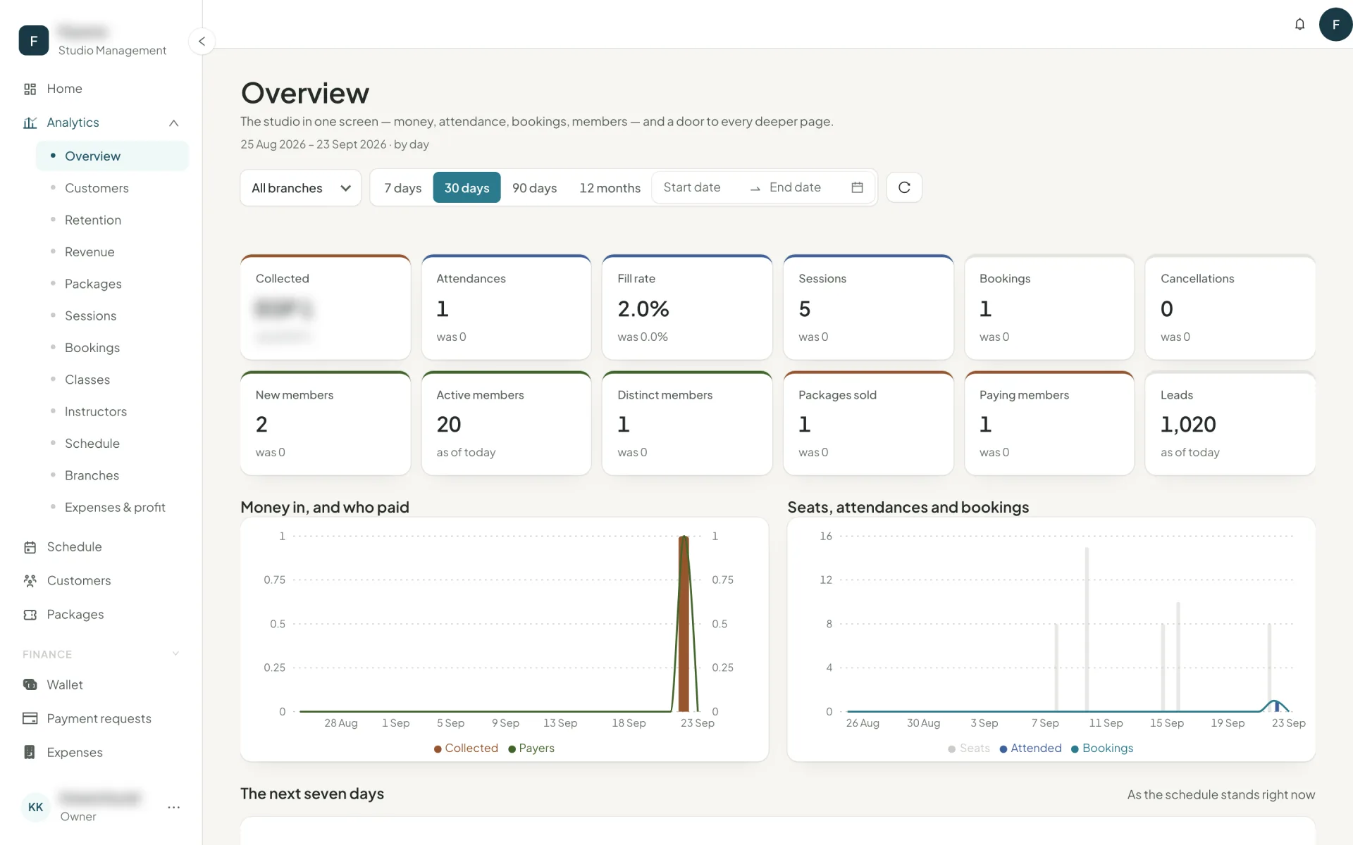
Overview, customers, retention, revenue, packages, sessions, bookings, classes, instructors, schedule, branches and profit — what each one answers and when to open it.
Analytics holds twelve reports. Each takes a date range — 7 days, 30, 90, 12 months or custom — and a granularity of day, week or month.
The twelve
| Report | Answers |
|---|---|
| Overview | The studio in one screen — money, attendance, bookings, members, and the next seven days. |
| Customers | Who the members are, where they came from, how often they come, who is worth most. |
| Retention | Who keeps coming, who renews, who comes back — and a new member's first six months. |
| Revenue | What came in, from whom, for what, how it was paid, when. |
| Packages | What sells, what gets used, what expires unused, what gets bought again. |
| Sessions | Supply and demand — how many classes, how full, how many empty. |
| Bookings | How members book: how far ahead, through what channel, and how they cancel. |
| Classes | Every class family side by side: fill, loyalty, first-timers, money in, instructor cost out. |
| Instructors | Every instructor side by side: hours, fill, members who come back to them, what they earn the studio. |
| Schedule | Where the timetable is full and where it is empty. |
| Branches | Every location side by side. |
| Expenses & profit | What went out against what came in — and what each class leaves after pay. |
The five that change decisions
Retention
The renewal chart — packages that ended in each period and how many were renewed within 30 days, with a line for those that ended with unused credits. Underneath, the first-six-months curve: of the members whose first visit was in this window, how many were seen again in each following 30-day period.
That curve is the single most useful chart in the product. If it falls off a cliff in month one, your problem is onboarding, not marketing.
Schedule
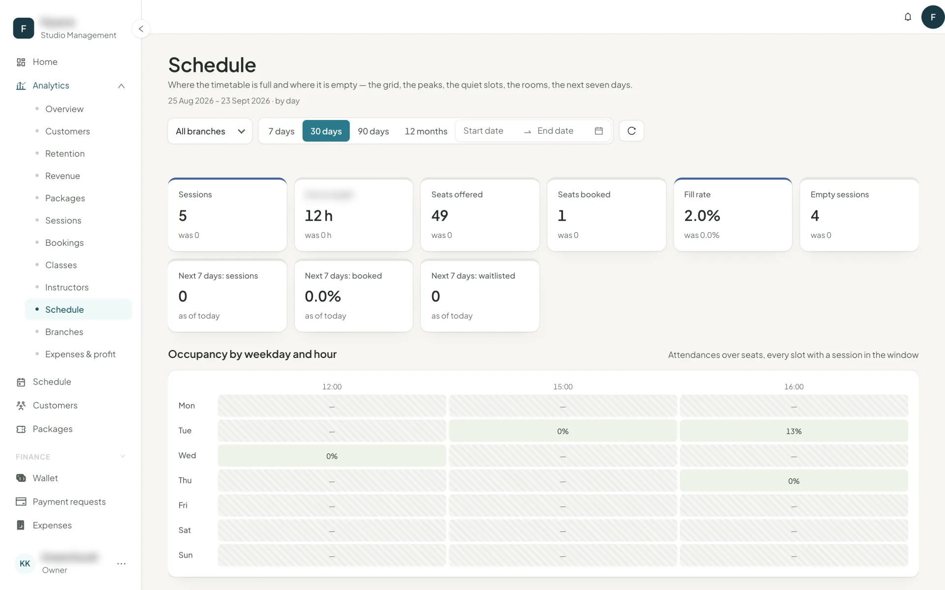
An occupancy heatmap by weekday and hour, plus busiest slots and quietest slots — the latter explicitly labelled as candidates to move or merge. This is the report that rebuilds a timetable.
Classes and Instructors
Two league tables with the same columns, sorted by attendances: fill, came back (members with 2+ attendances), first-timers (members whose first ever visit was here), revenue recognised and instructor cost.
Came back is the one to read. A class with high attendance and low return is a class people try once. An instructor with high first-timers and high return is the person to build the timetable around — and the one to pay more before somebody else does.
Expenses & profit
Collected against expenses and payroll per period, then margin per class and per instructor after the cost of teaching. A popular class that loses money is only visible here.
Cohorts
On Home: each sign-up month as a row, the share still holding a package after 1, 2, 3… months as columns. Cohorts under the ranking size are greyed and left out of averages, and months that have not happened yet are dashes rather than zeros.
It reads left to right for one month's loyalty, and top to bottom for whether you are getting better. "Members who joined in March retained best: 62% after 6 months" is written out for you underneath.
Two distinctions that explain most confusion
Collected vs recognised. Collected is cash in the window. Recognised is the value of classes attended. Sell a 3-month package in January and you collect in January but recognise until April.
Bookings vs attendances. A booking is an intention; an attendance is a check-in. Payroll, fill rate and risk all count attendances. The difference between them is its own figure — booked → attended — and a falling one is worth more attention than a falling booking count.